

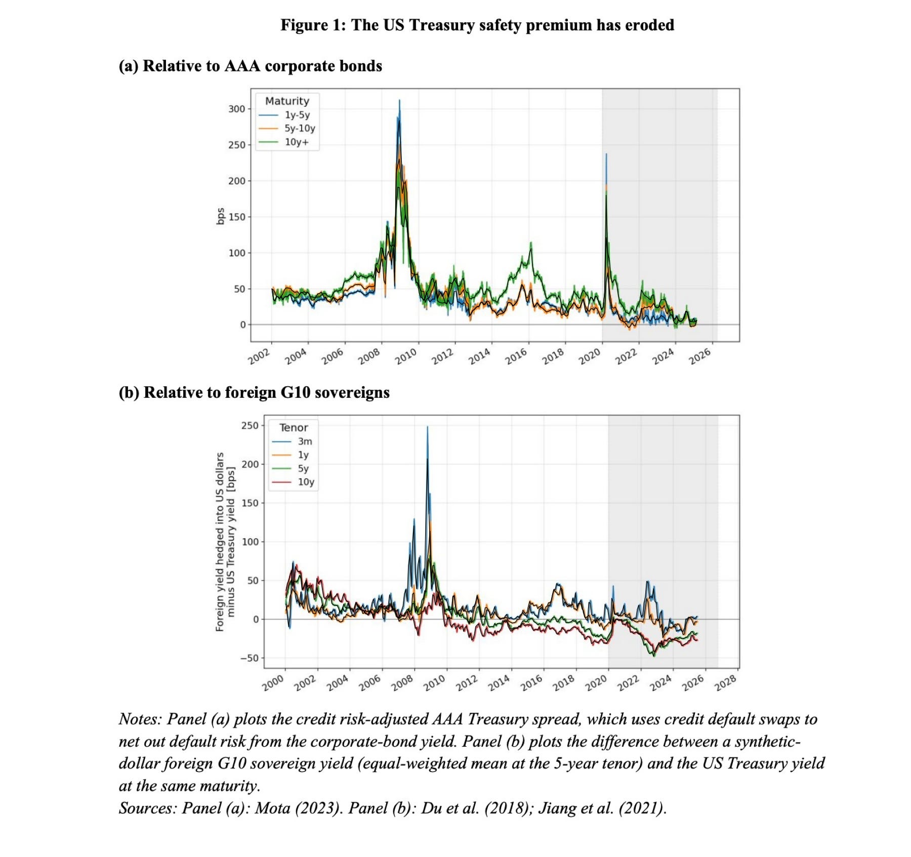
Adam Tooze’s recent post pointed me to an eye-opening analysis by Hanno Lustig for the Aspen Institute. The money shot is in this pair of graphs:
If this feels like it’s from another planet, don’t worry. It’s a chart that shows what the end of American empire looks like. If you were scared off economics by pictures like this, here’s a painless introduction.
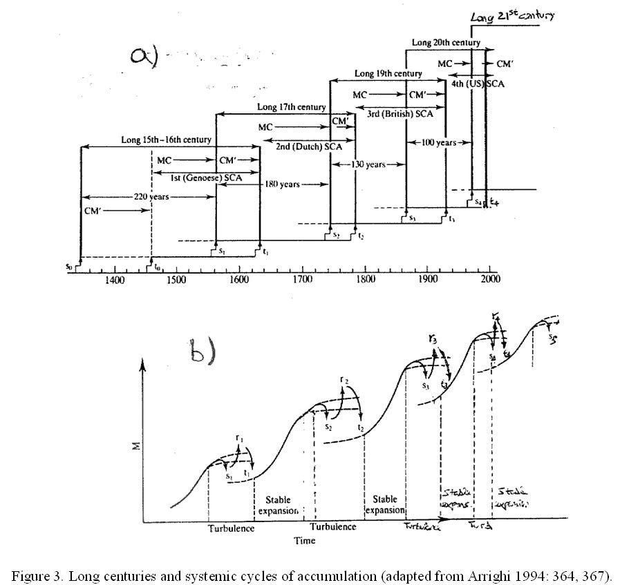
One of the ways the U.S. has projected power is through a military and economic umbrella under which the rest of the world has sheltered. The British provided a similar umbrella before. Before them, the Dutch and the Genoese. This periodisation comes directly from the late, and deeply lamented, Giovanni Arrighi in which he charts a series of ‘systemic cycles of accumulation’, led by a single state power.
What Lustig’s data shows in Panel (a)—drawing on methodology by Lira Mota at MIT—is that the difference between the best corporate bonds and the best U.S. Treasury bonds was once big and has now narrowed to almost nothing. Once upon a time, the U.S. government was the safest bet in the world. Now, US Treasuries have lost their additional safety-and-liquidity premium relative to, say, Microsoft.
Meanwhile, Panel (b)—drawing on work by Du, Tepper, and Verdelhan (2018) and Jiang et al. (2021)—measures the spread against foreign G10 sovereigns hedged into dollars. Global investors who once paid a steep premium for the privilege of holding American debt now frequently prefer the safety of foreign sovereign bonds.
Lustig’s argument is that financial markets have seen through a scam that American policymakers have found usefully self-beguiling. In government, there’s a cycle of spending and borrowing that allows policy elites to pretend they haven’t run off the cliff and won’t soon be exposed to the forces of gravity.
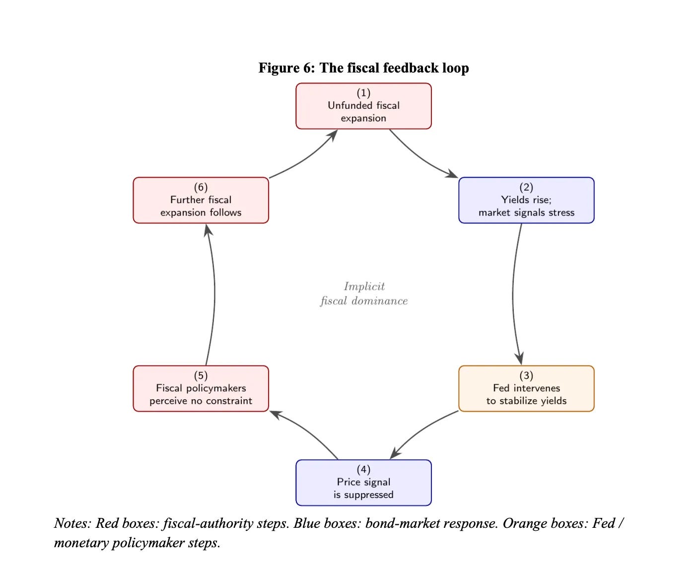
Traders who lie to themselves go broke, so they remain unpersuaded that the U.S. dollar is the wondrous safe haven it used to be. The U.S. government is no longer able to command the “exorbitant privilege”, a term popularized by Valéry Giscard d’Estaing in the 1960s, of borrowing profligately while paying next to nothing for the privilege. Instead, Washington is caught in what Lustig terms an implicit fiscal dominance feedback loop:
The Fiscal Feedback Loop (Lustig 2026)

Spot the difference.
Spending, like the recent One Big Beautiful Bill is funded by borrowing. That fiscal expansion drives up the price that the US government has to pay to borrow. The Federal Reserve steps in to stabilize those yields, because high interest rates are unpopular in an election year. Suppressing the price signal tricks policymakers into believing there is no fiscal constraint, which prompts yet another round of unfunded borrowing, which policymakers pretend is fine, even though the markets can clearly see it isn’t fine at all.

For folk who read Giovanni Arrighi, seeing this play out in real time begs the question of when we are in the clock of the world. The relationship between corporate bonds, sovereign Treasuries, and global capital has a much longer history. With a long enough view of bond risk, you can compass not just the decline of the U.S., but its rise too.
In The Long Twentieth Century, Arrighi showed that every hegemony is defined by two distinct phases:
Material Expansion : Capital earns massive returns by producing real goods and expanding physical trade. Money is turned into commodities and then into yet more money.
\((M \to C \to M’ )\)Financial Expansion : Following what Arrighi calls a signal crisis, industrial profit margins fall due to global overcapacity. Capital flees production for liquidity and financial speculation. Capital skips the commodities part, and heads straight for financial returns. This isn’t to say that things aren’t produced, but it is to say in whose hands the economy lies.
\((M \to M’ )\)
Reposted from Empire Without Emperor
When the bankers take over, they temporarily supercharge the economy during a financial Belle Époque, before overseeing its eventual terminal crisis. In A History of the World in Seven Cheap Things, Jason W. Moore and I argued that capitalism runs on cheapening, and that cheap money is the cheapening that pays for all the others. The cheapest money in the modern world system has been the American government’s own borrowing. But cheap things are always an exercise in postponing a bill that inevitably needs to be paid. Cheap money has an expiration date.
Is it possible to stretch these datasets back to see the rise of the U.S., its signal crisis, and its terminal twilight all in one single arc? With some back-of-envelope faffing about, yes.
To extend Lira Mota’s default-adjusted series back before credit default swaps existed, there’s a proxy, made by Arvind Krishnamurthy and Annette Vissing-Jorgensen (2012). They take Moody’s index of AAA corporate bond yields and subtract the long-term Treasury yield from 1926 onward. It’s sort of like the convenience yield on Treasuries across a full century, though it’s not perfect (you can see Lustig’s line on the same graph matching in times of crisis and lower otherwise) and I’d definitely think twice about posting an LLM-generated graph into a peer-reviewed paper (though for the curious, the workbook is here). For this post, it’s just an indicative sketch.
Similarly, you can trace how finance’s share of domestic profits has risen and fallen from the Bureau of Economic Analysis’ corporate profits by industry via FRED. If you take domestic industries and subtract nonfinancial industries, both of which have handy unbroken quarterly series from 1947.
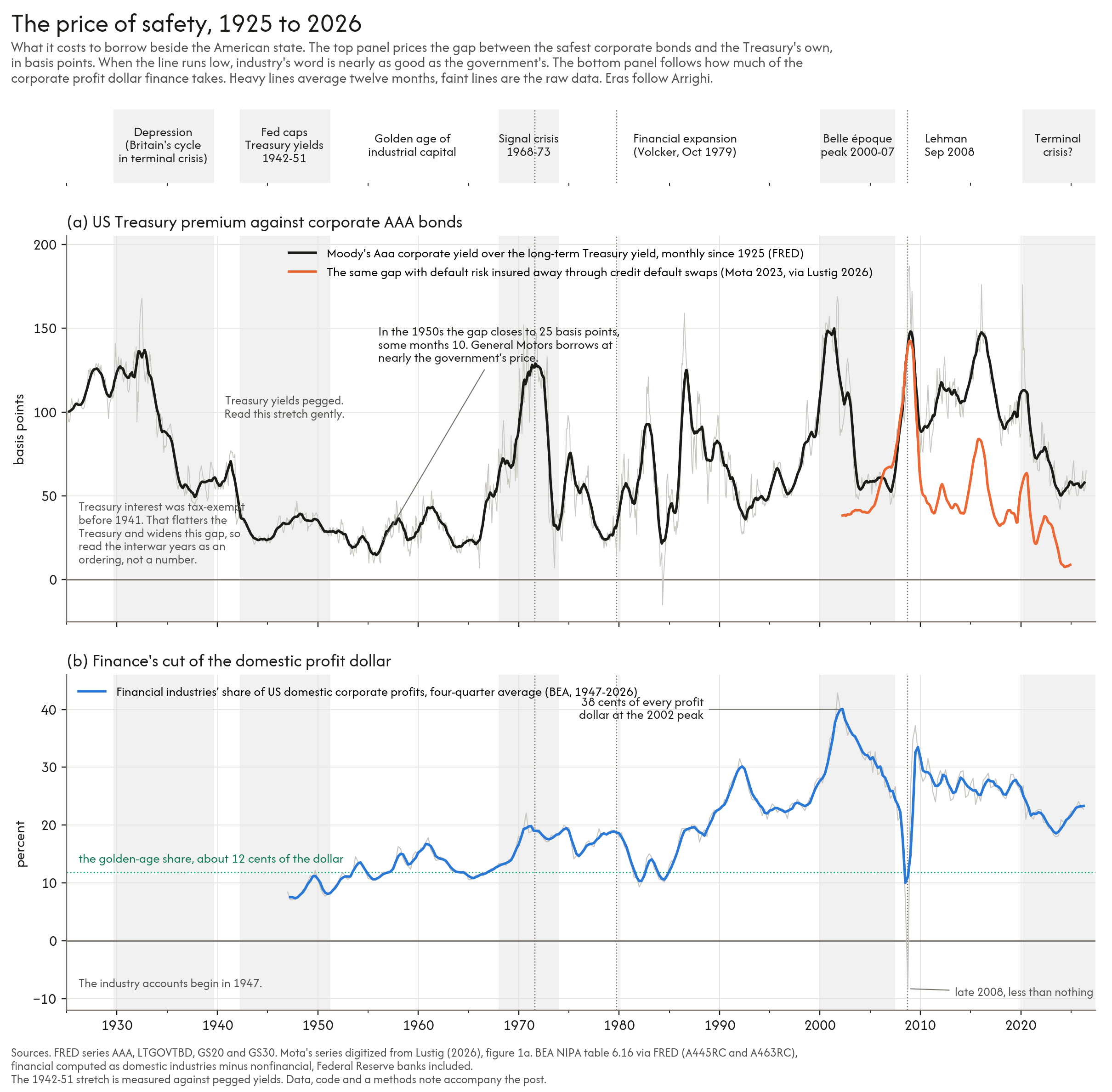
When you stack that safety premium (Panel a) on top of finance’s share of U.S. domestic corporate profits (Panel b), you can compass the political economy of the American Century, and figure out when we are right now.
The Golden Age of Industrial Capital (1925–1968): The Treasury safety premium was immense. After WWII, the US became the world’s hegemon, and its industry turned money into commodities into profit. Panel (b) shows that within the US, GM borrowed at near-government prices because American industrial production was the engine of the world. Finance, by contrast, took a modest slice of domestic corporate profits, hovering around 12 cents of every profit dollar.
The Signal Crisis (1968–1979): U.S. manufacturing profit margins collapsed under global competition. The U.S. hit its signal crisis, severing the dollar from gold in 1971 and ushering in Paul Volcker’s high-interest-rate regime in 1979. Capital pivoted decisively into finance.
The Financial Expansion (1980–2007): Finance controlled an ever-larger share of the economy, peaking at 38 cents of every corporate profit dollar by 2002. Paper wealth exploded while the domestic industrial base hollowed out.
The Terminal Crisis (2008–Present): The 2008 crash sent financial profits plunging below zero, forcing the U.S. state to socialise Wall Street’s losses. We’re all living in that aftermath of the Obama era choice to turn private financial debt into public obligation.
As the orange line in Panel (a) shows, the default-adjusted safety premium on U.S. Treasuries has now fallen pretty much to zero. Trace it back over its century-long arc, and you can see the flow and ebb of U.S. hegemony, from its industrial origins through its financialized autumn, to the moment the sovereign era finally runs out.
I’ll be presenting some of this to La Via Campesina in a workshop on neoliberalism - the period that corresponds to the moment bookended by the signal and terminal crises - next week. I’ll post the flyer on Bluesky, LinkedIn and Twitter. It’ll also all feature in a new short book, but wanted to float this here now, to see whether I’ve cracked making sense of this to folk who are further from economics than they’d like. So if this is still baffling or makes you want to ask more, please do.